by Ilene Strizver
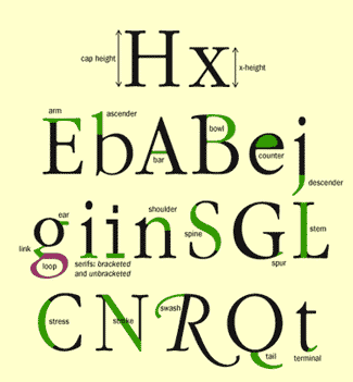
As in any profession, type designers have a specialized vocabulary to talk about the different parts of letters. It isn’t necessary to commit the entire list to memory, but familiarizing yourself with this terminology will make it easier to communicate about typefaces and their characteristics. It will also help educate your eye to recognize the underlying structure of various designs and the differences among them.
Arm/leg – An upper or lower (horizontal or diagonal) stroke that is attached on one end and free on the other.
Ascender – The part of a lowercase character (b, d, f, h, k, l, t) that extends above the x-height.
Bar – The horizontal stroke in characters such as A, H, R, e, and f.
Bowl – A curved stroke which creates an enclosed space within a character (the space is then called a counter).
Cap Height – The height of capital letters from the baseline to the top of caps, most accurately measured on a character with a flat bottom (E, H, I, etc.).
Counter – The partially or fully enclosed space within a character.
Descender – The part of a character (g, j, p, q, y, and sometimes J) that descends below the baseline.
Ear – The small stroke that projects from the top of the lowercase g.
Link – The stroke that connects the top and bottom part (bowl and loop) of a two–story lowercase g.
Loop – The lower portion of the lowercase g.
Serif – The projections extending off the main strokes of the characters of serif typefaces.
Serifs come in two styles: bracketed and unbracketed. Brackets are the supportive curves which connect the serif to the stroke. Unbracketed serifs are attached sharply, and usually at 90 degree angles.
Shoulder – The curved stroke of the h, m, n.
Spine – The main curved stroke of the S.
Spur – A small projection off a main stroke found on many capital Gs.
Stem – A straight vertical stroke (or the main straight diagonal stroke in a letter which has no verticals).
Stress – The direction of thickening in a curved stroke.
Stroke – A straight or curved line.
Swash – A fancy flourish replacing a terminal or serif.
Tail – The descender of a Q or short diagonal stroke of an R.
Terminal – The end of a stroke not terminated with a serif.
X-height – The height of lowercase letters, specifically the lowercase x, not including ascenders and descenders.
ขอขอบคุณที่มาของบทความ
http://www.fonts.com/content/learning/fontology/level-1/type-anatomy/anatomy

ไม่มีความคิดเห็น:
แสดงความคิดเห็น